Better Natured, Henkel Beauty
ROLE: UI/UX Designer, Creative Lead
Better Natured was introduced by Henkel’s Beauty division under Zotos Professional as a prestige brand with naturally-derived* formulations that are stylist-developed and tested to deliver professional-level performance.

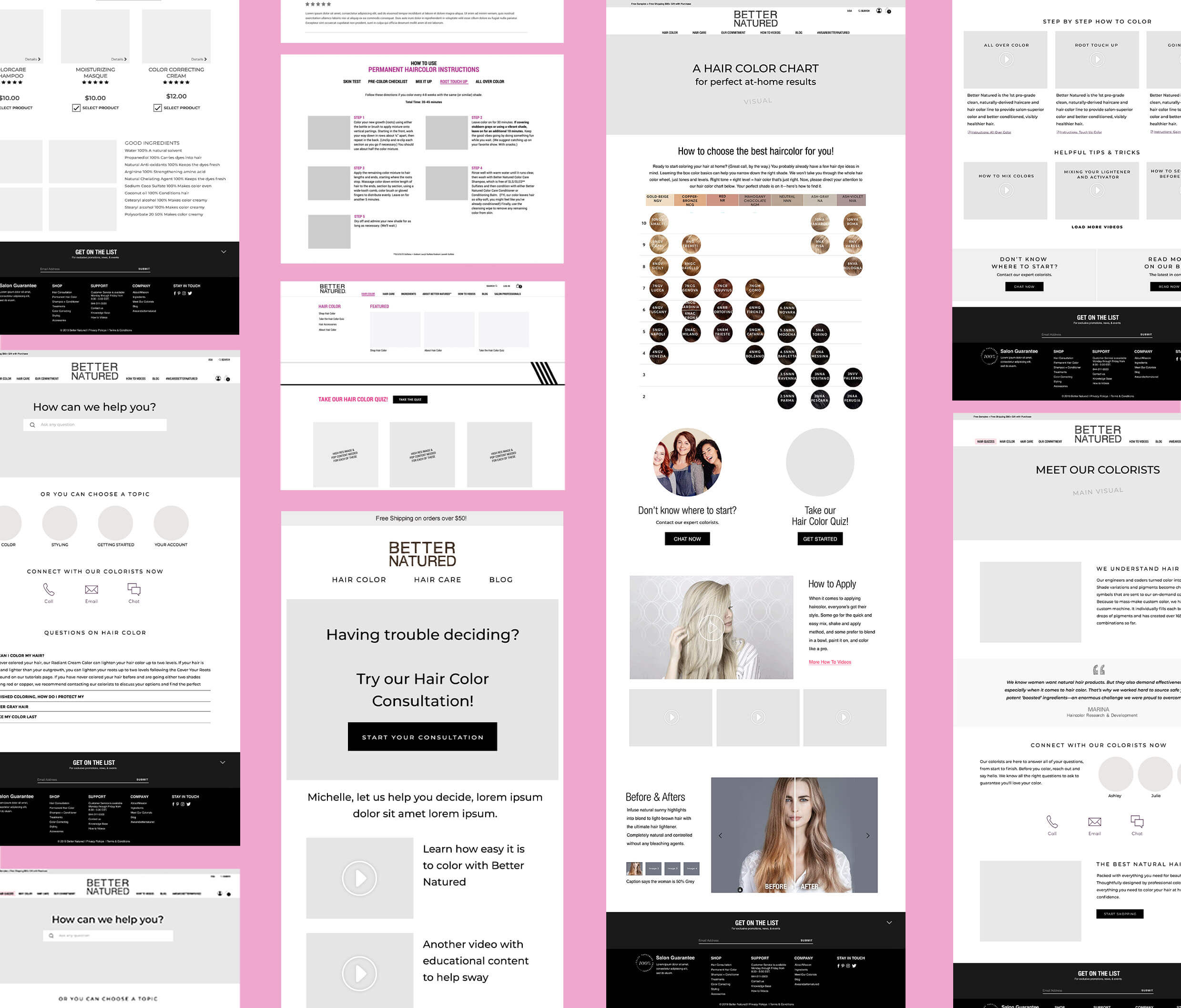
The objective was to help Better Natured craft an experience strategy in Shopify built on highlighting the brand’s beliefs and values and showcasing their hair color as a customizable product that is easy to do at home.
Research was the foundation of the design process. I led the team in analyzing competitors and identifying the key elements that made their websites successful. I was able to provide wireframes that aligned with the overall strategy, integrating key insights from the launch plan that included SEO, paid media, and PR to optimize engagement and conversion.
APPROACH
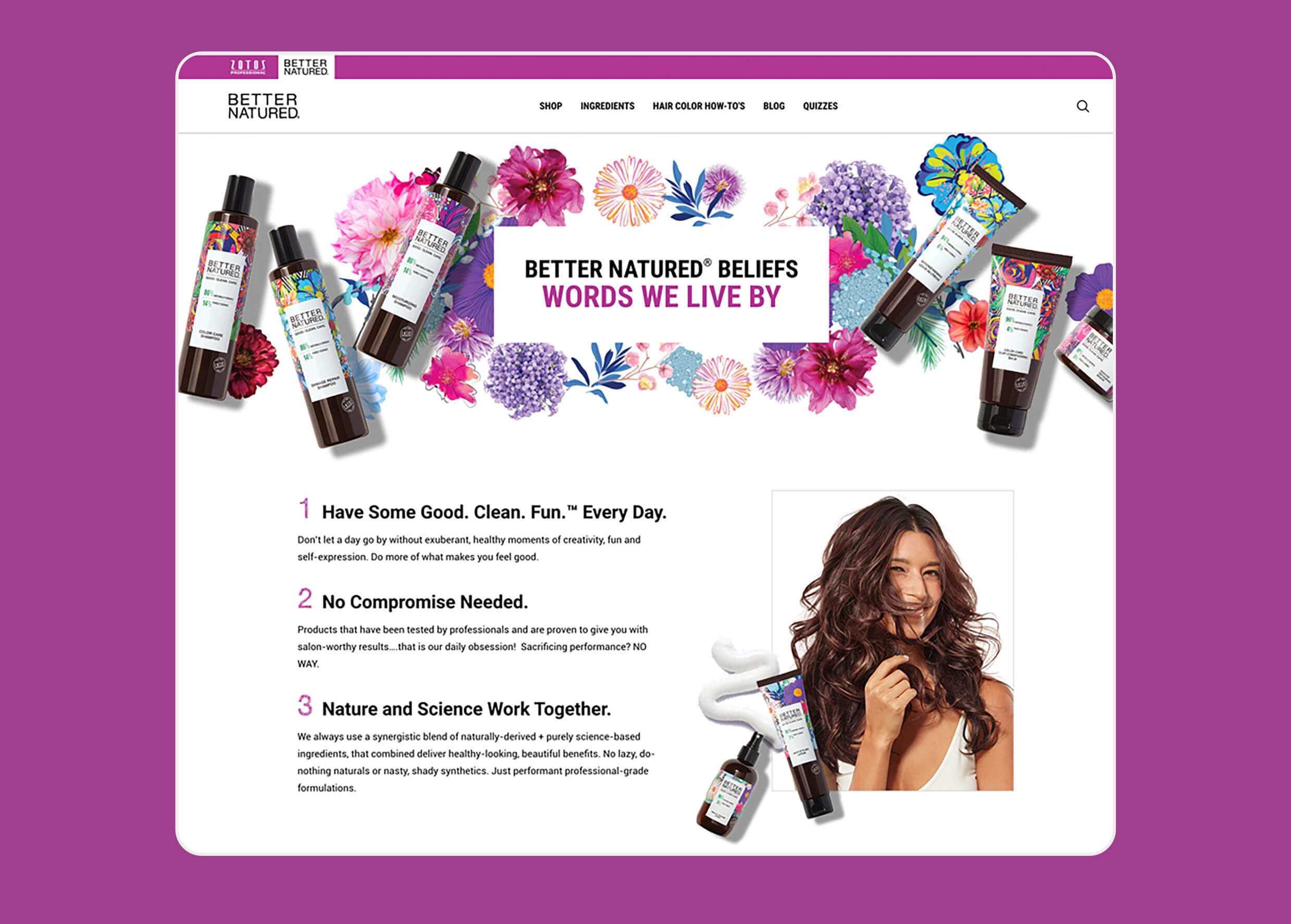
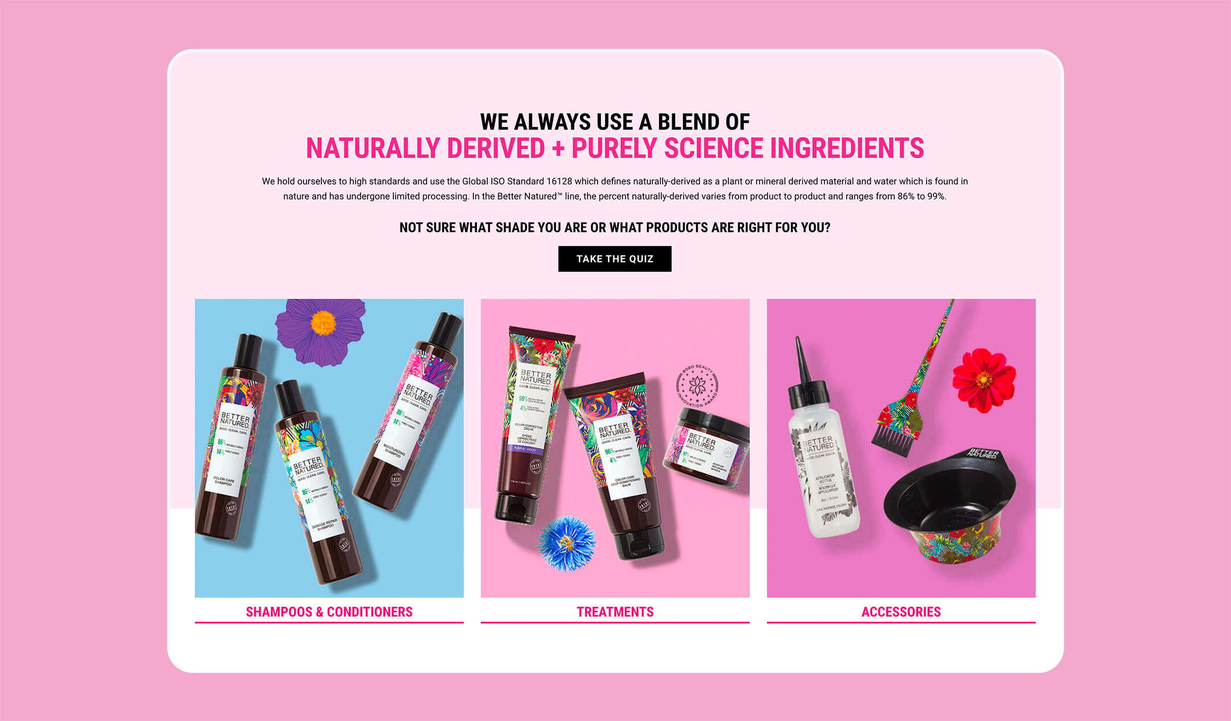
Ultimately, the creative concept and strategic recommendation was guided by Better Natured’s mission to be transparent about its use of naturally derived + purely science-based ingredients while maintaining effectiveness in hair care and color treatments.
Placing key sections like their “Clean Pledge,” ingredient transparency, sustainability efforts, and their dedication to adhering to the Global ISO® Standard 16128 helped highlight their commitment to clean beauty.

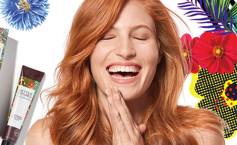
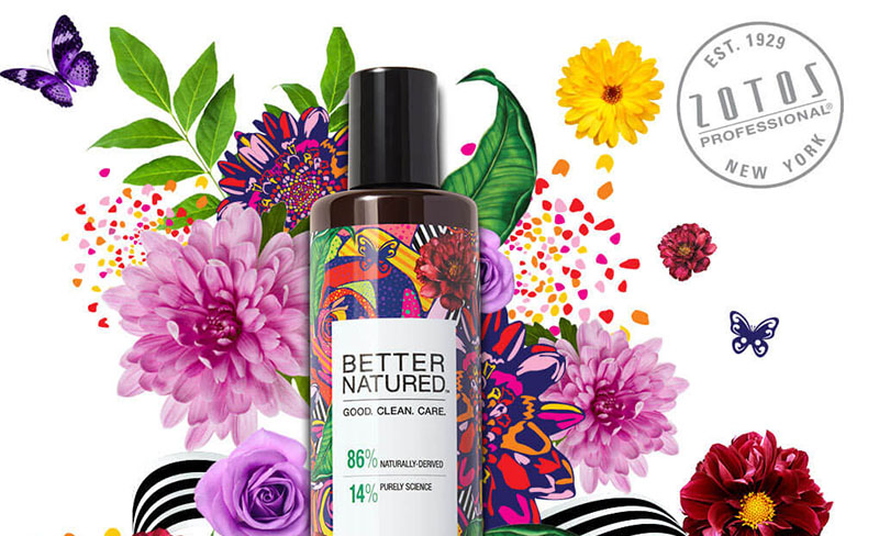
I leaned into the vibrant packaging and embraced a playful approach, incorporating bold colors, layering, and floral arrangements to bring the products to life. This aligned with the manifesto’s themes of fun, creativity, freedom, and play.

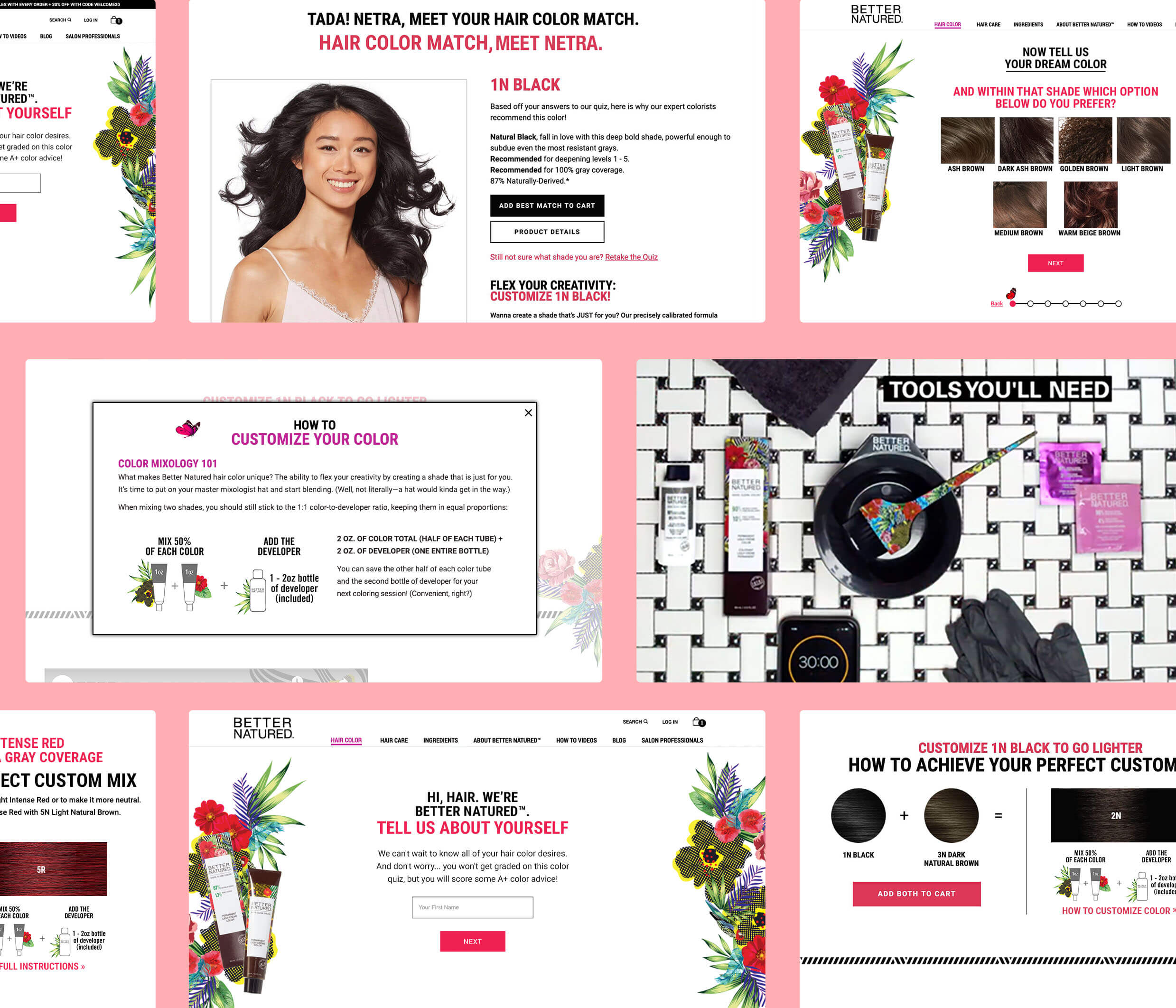
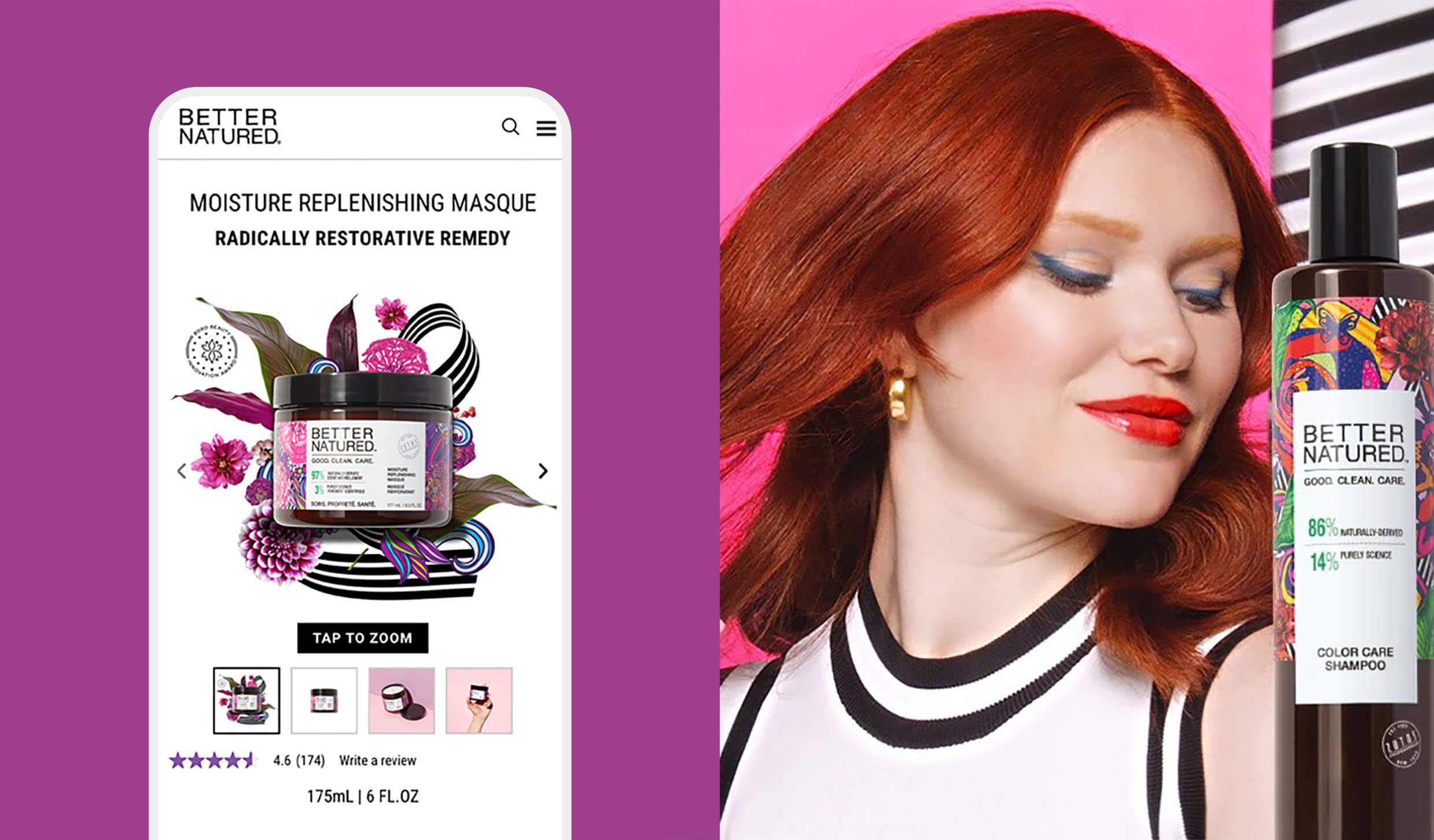
A key goal was to showcase Better Natured’s salon-quality at-home hair color kit as their signature offering while emphasizing its customizable shades.
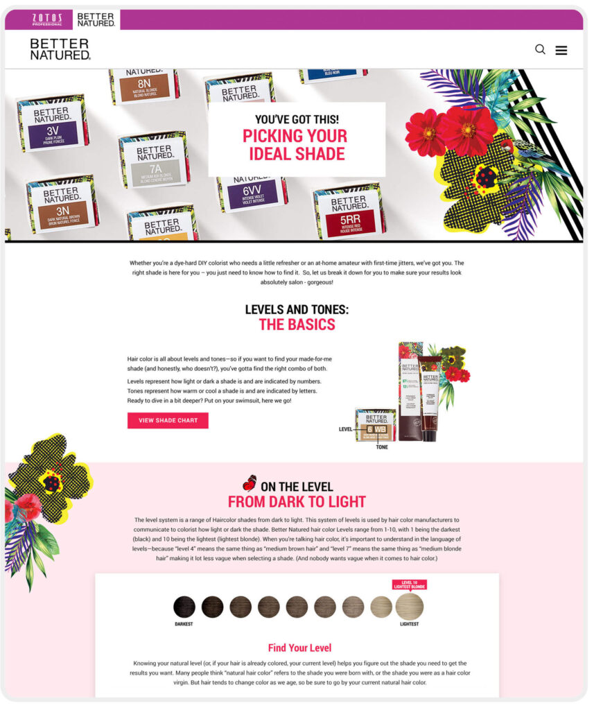
A major challenge in designing the PDP for the hair color page was showcasing the 26 available shades while also conveying the ability to create up to 42 shades through custom mixing. After testing several iterations, we optimized the diagnostic tool to handle this functionality. Video content and post-purchase educational emails further supported this goal.
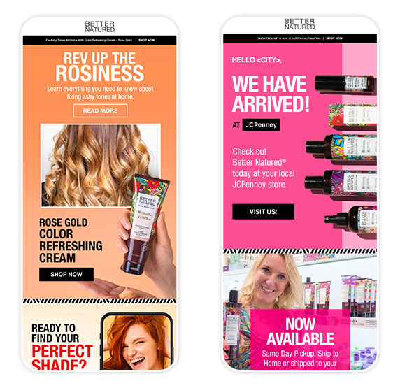
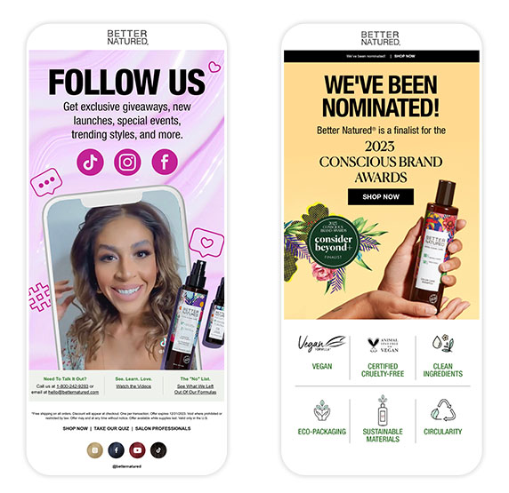
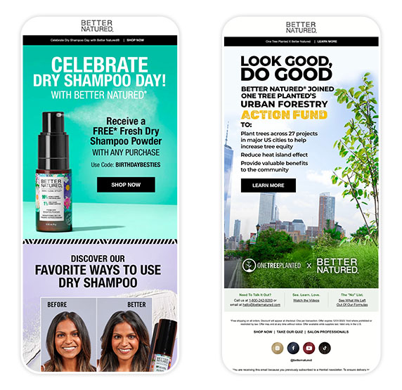
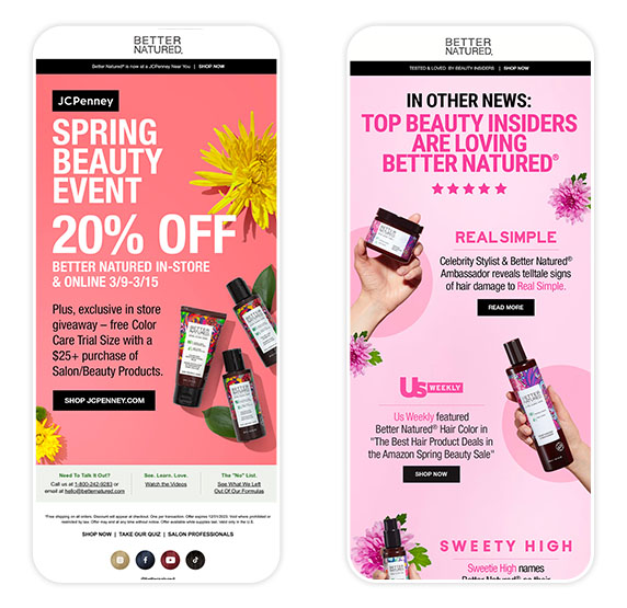
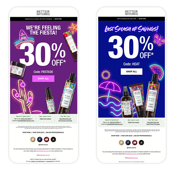
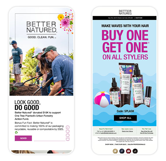
Email strategy was a key component of the client’s design ecosystem. I designed notification emails, welcome sequences, abandonment and post-purchase flows, and weekly promotional campaigns as ongoing support for Henkel.
I ensured WCAG compliance on the front end for Better Natured by maintaining sufficient color contrast for readability, using descriptive link text, creating clear hierarchy for information and optimizing the checkout process for accessibility.
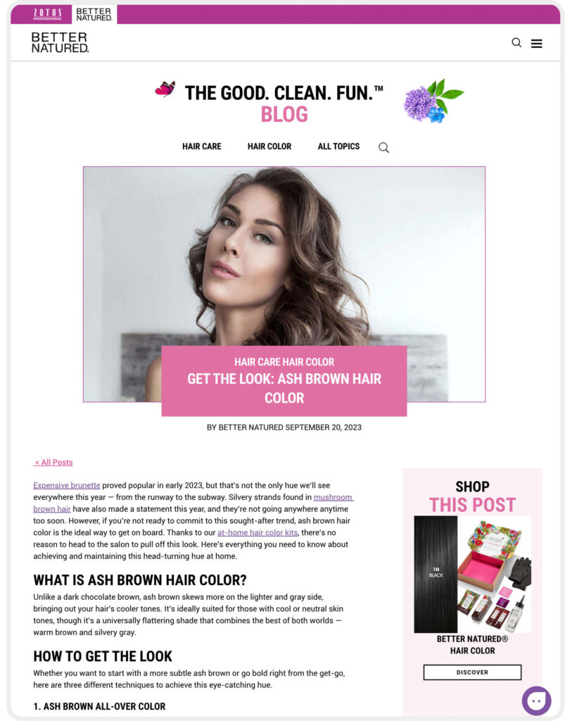
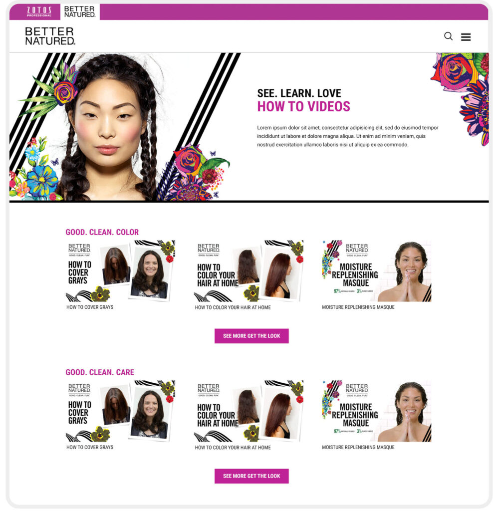
Better Natured wanted to make education on how to use the at-home kit a priority by integrating videos, a blog, and step-by-step instructional pages to help consumers color their hair with confidence.
The site underwent multiple iterations and refinements. Hotjar reporting, ADA compliance testing, and surveys & focus groups were conducted over time to improve the user experience.
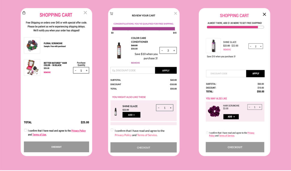
For example, additional improvements were made to the checkout flow, including promotional code calculations, the addition of free sample options, and incentives to reach the free shipping threshold.
POST LAUNCH INSIGHTS
Heat Maps Can Help Expose Hidden User Interaction Patterns
In a heat map analysis of their signature hair color kit’s product detail page (PDP), it was discovered that users have a tendency to click on the hair color quiz in the top fold instead of the “Add to Cart” button. While engagement is typically a positive metric, in this case, users were getting distracted by the quiz instead of completing purchases.
We realized on mobile, where most of our customers browse from, the tout for the quiz took up a great deal of real estate and was higher that the CTA, so we updated the design to responsively reduce the size of this tout on mobile sizes, in addition to collapsing the shade chart to a smaller area to get the Add to Cart CTA higher on the page and this helped increase conversion.
Additional edits like making the image carousel sticky, which demonstrated very high user engagement, complemented our approach of collapsing content lower on the page to enable easier scrolling in the right column. These interface modifications further streamlined the user experience by keeping key visual elements consistently accessible while reducing visual clutter and simplifying navigation.